A Data-Centric Approach to Capital Program Management
Introduction
Our lives are increasingly intertwined with data. From the web sites we visit to our social media interactions, every touchpoint is being tracked, analyzed, and used to predict our every want and need. If you have an iPhone, Siri knows which apps you use, and with the help of algorithms, at what time of day to suggest them for your convenience. At times it can feel intrusive, cold, calculating, and mindless. But occasionally, it is just what we needed. So why would we want to introduce this type of data analytics into design and construction? We know that our industry is inefficient, dated, and ripe for disruption. But how do we balance changing an inefficient process with increasingly scarce capital dollars? How do we drive change in an industry that is often unwilling to change? And more importantly, how do we create a culture of predictable outcomes to protect our precious capital dollars? One way is to harness the data. Data can tell a story, predict risk, inform our decisions ultimately allowing us to be more in control of the outcomes. Simply capturing and reporting on data, however, will not alone ensure success. It cannot guarantee on time and on budget delivery, but it can align expectations with stakeholders and better define the most successful outcome available.
Our Journey
Back in 2010, UC San Diego moved to a new Project Management Information System (PMIS) to gain more transparency into a very robust capital program. Making a change to a mission critical system is no small undertaking and can be a serious challenge to even the best change management skills. Like most organizations, we faithfully reproduced our inefficient paper workflows electronically. We had no appreciation for the power of the data we were capturing, nor did we strategically think about the data we would eventually need to track. Over the years we continued to refine the system to make it more central to our operations and strategically invested in its development. Progress was slow at best. Adoption was even slower making it difficult to consistently report across our projects. But there were high points scattered throughout the journey. Some large projects began to experiment with the system’s many features and eventually became pilots for testing potential enhancements. This allowed the entire department to see the potential power of our PMIS as a single source of truth that gives more than it receives.
Fostering a Data-Centric Culture
To successfully make the transition to a data-centric organization that consistently captures and makes use of data, your entire leadership team must be onboard. The data needs to be used daily for discussing project performance, analyzing internal processes, and uncovering risk. But first you need to determine where that data will be stored and how it will be organized. Ideally you already use a robust PMIS, however, if your organization is like most, its adoption has been sporadic and uneven leaving many of its advanced features underutilized or completely abandoned. Overcoming this will be a slow process and may require several attempts at re-adoption and additional training before success is realized. Here are some suggestions that will assist you as you plot your course.
- Ditch the spreadsheets. Not all of them, but you will get the idea. Your PMIS is now THE single source of truth for your operation. Allowing your project managers to maintain their own accounting for critical data basically allows multiple versions of the truth to coexist.
- Identify your champions. These are the individuals who see the big picture. They understand the value of the data and can help train and reinforce other staff. They are your early adopters and will help drive change.
- Identify the behaviors and mindsets to reinforce as well as the ones to correct. Always be consistent.
- Invest in the necessary tools and reporting software to analyze your data. Our industry often makes do with what we have versus what we need. If your PMIS is not equipped with a form of business intelligence, you may be able to export the data and analyze elsewhere in another software like Microsoft Power BI or Tableau.
Keep in mind, data analytics is not just a better spreadsheet. It will take time for your staff to see the data as the go to source for answers and the most valuable tool in their tool belt.
Identify Your Metrics, KPIs, and Approach
 The best way to approach this effort is to look at your organization’s past successes and failures. What problems do you consistently have on projects? What feedback have you received from your clients or stakeholders? Are you constantly being compared to other organizations (i.e., you are too expensive!)? Or the ever favorite “you’re never on budget or on time”. Collect these ideas and then begin evaluating the data you already have on hand. If it does not yet exist, you will need to find a way to capture the information in a consistent and transparent manner. Staff will never remember to fill in random blanks in your PMIS. If your PMIS supports structured workflows, build or change them to capture the data on your behalf without any intervention.
Next begin identifying your metrics and key performance indicators (KPIs). How will the data be analyzed? Will you use comparisons and benchmarks? As you formalize your metrics and KPIs, remember that predictable outcomes for capital projects is the primary goal. These metrics will replace the anecdotal evidence you currently share with your senior leadership.
Here are some common metrics and KPIs and how they can be used to tell a story:
|
RFI/Submittal Turn Around Time |
➔ |
Early Indicator of Potential Claims or Bottlenecks |
|
Causality of Change for RFI or Change Order |
➔ |
Identify Weaknesses or Potential Risks in Team Skillsets and Quality of Documentation |
|
Cash Flow (specifically the contractor’s) |
➔ |
Early Indicator of Delays |
|
Estimate at Completion |
➔ |
Manage Stakeholder Expectations for Cost |
|
Original Budget vs. Final Cost |
➔ |
Answers the Question About Budget Successes and Deltas |
|
Project Health (Red, Yellow, Green) |
➔ |
Identifies Projects in Need of an Intervention or Ongoing Trends with a Project Manager |
|
Project Risks/Potential Change Orders |
➔ |
Provides a Complete Picture of the Project’s Financial Health |
|
Staff Workload |
➔ |
Overworked? Or Underutilized? |
|
Total Capital Program by Fiscal Year |
➔ |
Good Metric for Your Departmental Costs |
|
Baseline Schedule Dates |
➔ |
Can be Compared to Current Schedule Performance |
|
Actual Completion/Occupancy Dates |
➔ |
Answers the Question About Schedule Success |
Choose metrics that can help cut through the noise. Large capital programs have many moving parts, and it is easy to create an information overload. Look for trends in the red/yellow/green project health categorization. Red projects are an obvious focus of your attention but beware of those in yellow. They can quickly shift to red.
It is also important to also understand project risk and make sure key stakeholders are aware of the degree of exposure each project is experiencing. Although sharing bad news can be difficult, it can build a culture of trust and understanding. The risk reporting should be at a high level and not a detailed breakdown of each issue. Make sure all risks are regular topics in meetings with your project managers and more importantly reflected in your dashboards.
Begin Building and Reinforcing
The simplest method for pulling data from multiple sources is to create a dashboard. Dashboards are the latest buzzword and often touted as the solution for every problem. The truth is that it will either tell you something valuable, or nothing at all, depending on the accuracy of your data. Generally speaking, dashboards should be an interactive solution and never viewed as a finished product. Evaluate them regularly and update as needed.
The following examples are not the actual dashboards developed at UC San Diego; however, they accurately illustrate the visual character and types of live information we track and share.
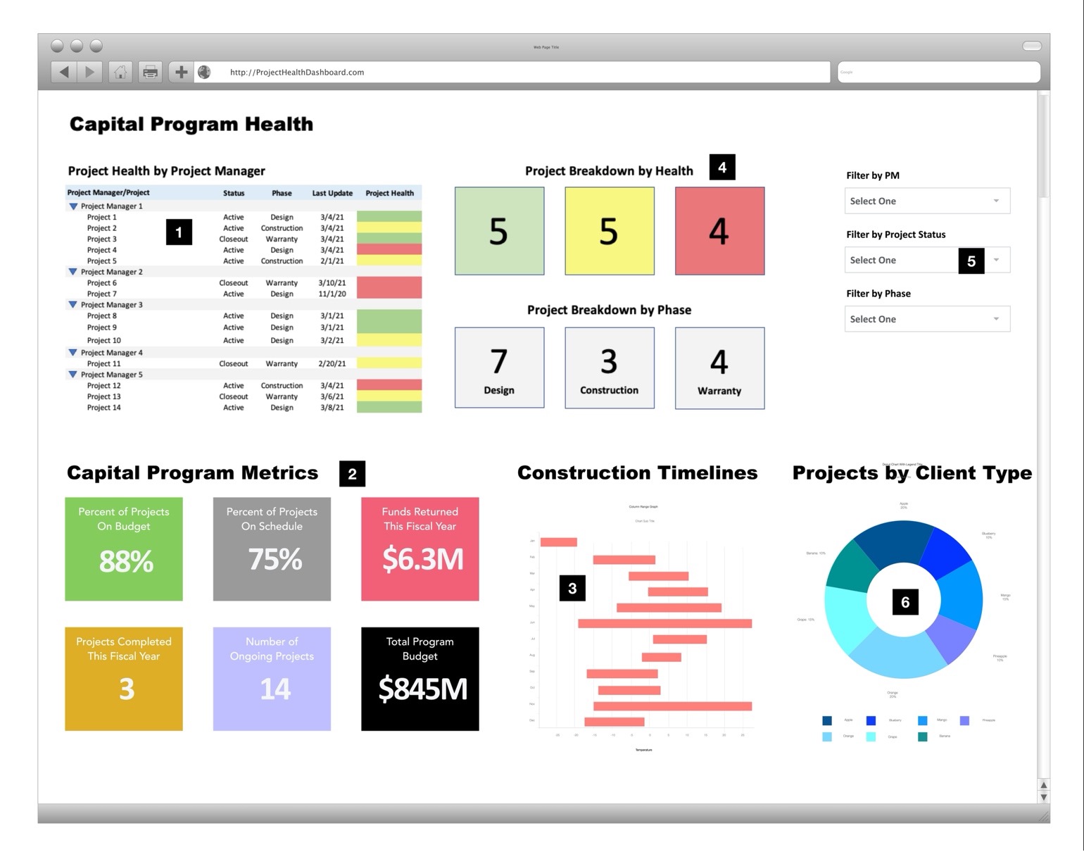 Dashboard Example 1: Capital Program Overview. This captures the overall health of the capital program.
Widget 1: A breakown of project health by PM can often reveal trends
Widget 2: At a glance metrics for the Capital Program that answers some of the common questions
Widget 3: Construction Phase overview for all projects
Widget 4: Projects grouped by health can quickly focus attention to the "red" and "yellow" projects
Widget 5: Dynamic filters will allow for slicing of data in multiple fashions
Widget 6: Quickly see the breakdown of projects by client or stakeholder
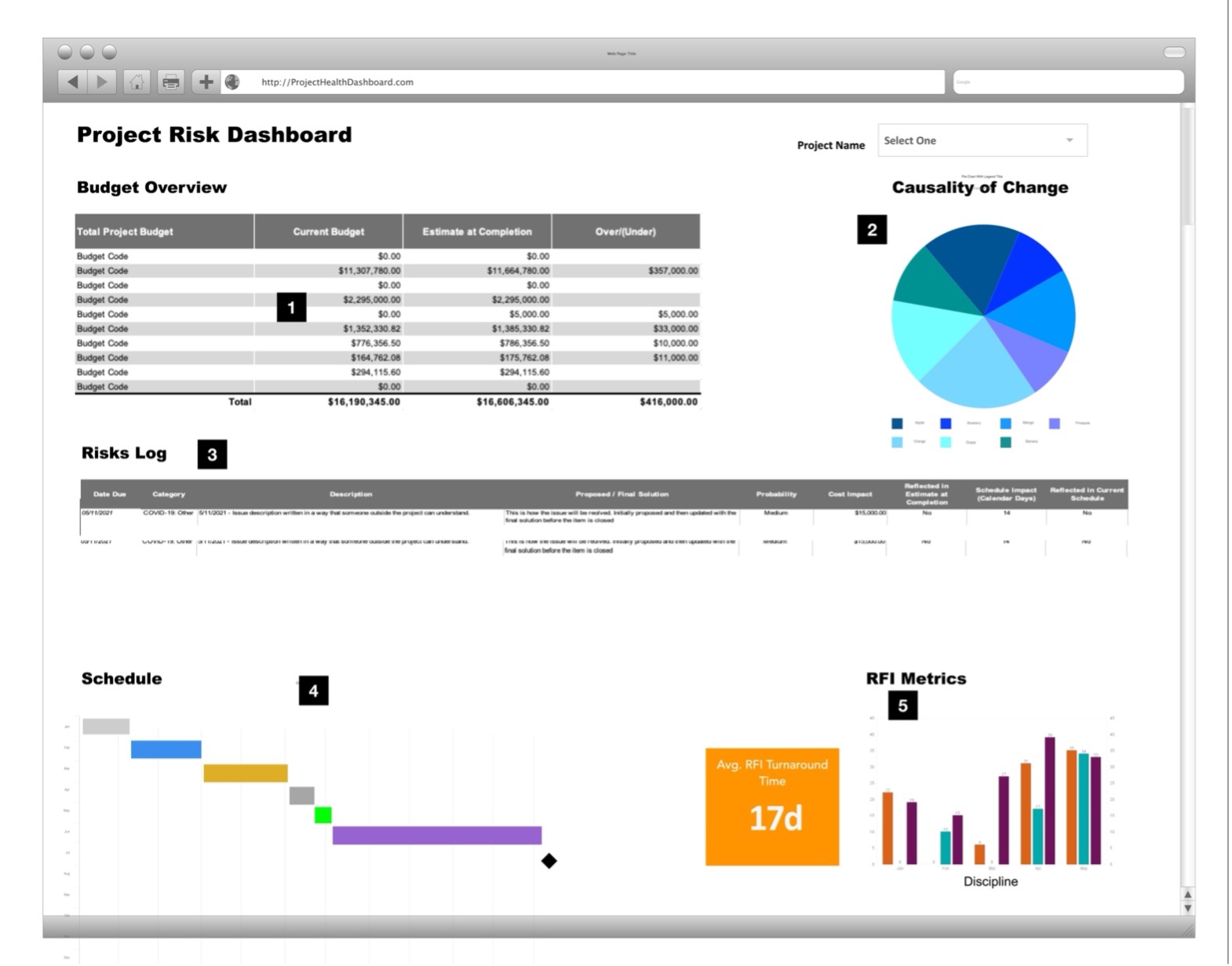
Dashboard Example 2: Project Risk Dashboard. This captures the overall status of an individual project.
Widget 1: High-level budget analysis comparing Approved Budget with Estimate at Completion
Widget 2: Causality pie chart for Change Orders that can predict risk not yet uncovered
Widget 3: Risk Log outlining any open risks and their potential impact to cost and schedule
Widget 4: High-level project schedule that identifies major dates including occupancy
Widget 5: RFI Metrics illustrating turnaround time and count by discipline
The dashboards and reports you create should be used as the basis for all your project interactions with staff and key stakeholders. It is critical that the single source of truth be maintained and not allowed to be overtaken by random, orphaned spreadsheets. The information should be readily accessible to staff and department leadership with some level of information accessible to your clients and stakeholders.
Use the data you are capturing to build trust by sharing it regularly with stakeholders. Pay attention to their questions and comments, which will likely lead to the next iteration of your analytics. Being vulnerable with the “truth” that you are sharing will lead to a more healthy and productive relationship built on trust and mutual understanding. Best of all, there will be no surprises.
Conclusion
Athletes and weekend warriors often share their workouts on a website and app called Strava (www.strava.com). Users of the site often say, “if it isn’t on Strava it didn’t happen”. Use that same approach with your staff. If it isn’t on the dashboard (or even in the PMIS) then it’s not real. No more secret spreadsheets allowed. Eventually they will come around to your way of thinking. Remember, accurate “at your fingertips” data is no longer a competitive advantage. It is the expectation and the price of admission. Do not expect the transition to a data-centric culture to happen overnight. The design and construction industry is very complex and not everyone is coming at this with the same level of knowledge and comfort as your early adopters. Eventually, your entire staff will become ardent supporters once they see the value of live data analyzed in real time.